MST Omega
Variable Typeface in Progress
One small step for type, one giant leap for typography.
The MST Omega typeface is a variable font mixing old-style grace with modern adaptability. It's inspired by my old Omega Seamaster watch (TV-Dial), and is also a nod to Omega's significant part in the Apollo 11 moon mission. The Speedmaster or "Moonwatch", often worn by astronauts, represents human creativity and discovery. The Omega typeface reflects this, combining the look of a traditional watch with the flexible nature of modern typography.
MST Omega was also nominated for Tirolissimo in Typography & Type Design in 2023.
MST Omega's design process involved extensive research into both the Omega Seamaster's design elements and the visual language of the Apollo 11 mission. The result is a typeface that is not only visually striking but also highly functional. Its variable font technology enables designers to customize the weight, width, and slant of the typeface, making it adaptable to various design contexts. This flexibility mirrors the adaptability of the Apollo 11 mission, where precision and innovation were paramount. The typeface includes a rich variety of weights, ensuring clarity and readability across different mediums, from digital screens to print.
OTHER PROJECTS

Durex – First TimesCampaign
SwarovskiSS24 – Inspiration Launch

Red BullDesign System
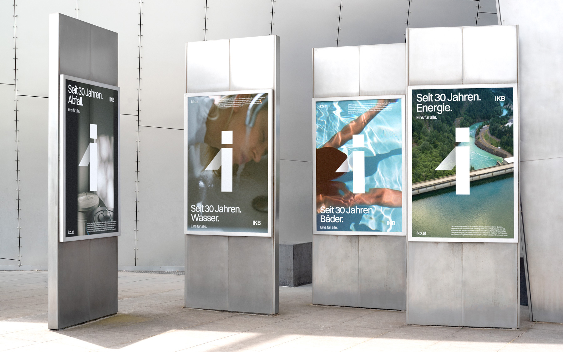
IKB – 30 YearsCampaign

DAU. Natascha & DegenerationBerlinale – 2020
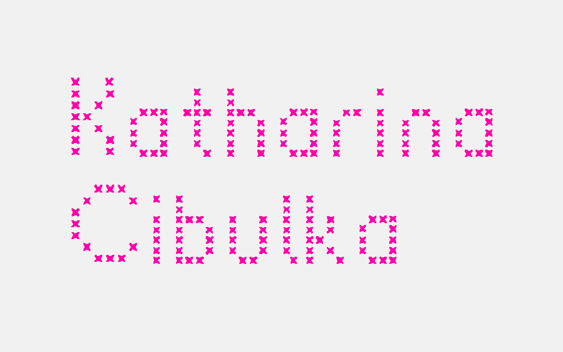
Katharina CibulkaWebsite

Kunstraum InnsbruckWebsite

AHC – Alpine Hockey CenterWebsite

Roberto RosselliniRetrospective & Collection

Little Joe by Jessica HausnerFestival de Cannes – 2019

About Endlessness by Roy AnderssonLa Biennale di Venezia – 2019
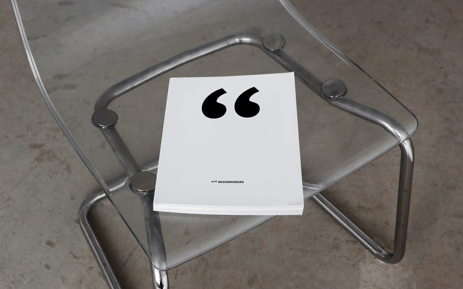
9966 – DesigndiskursDiploma Thesis
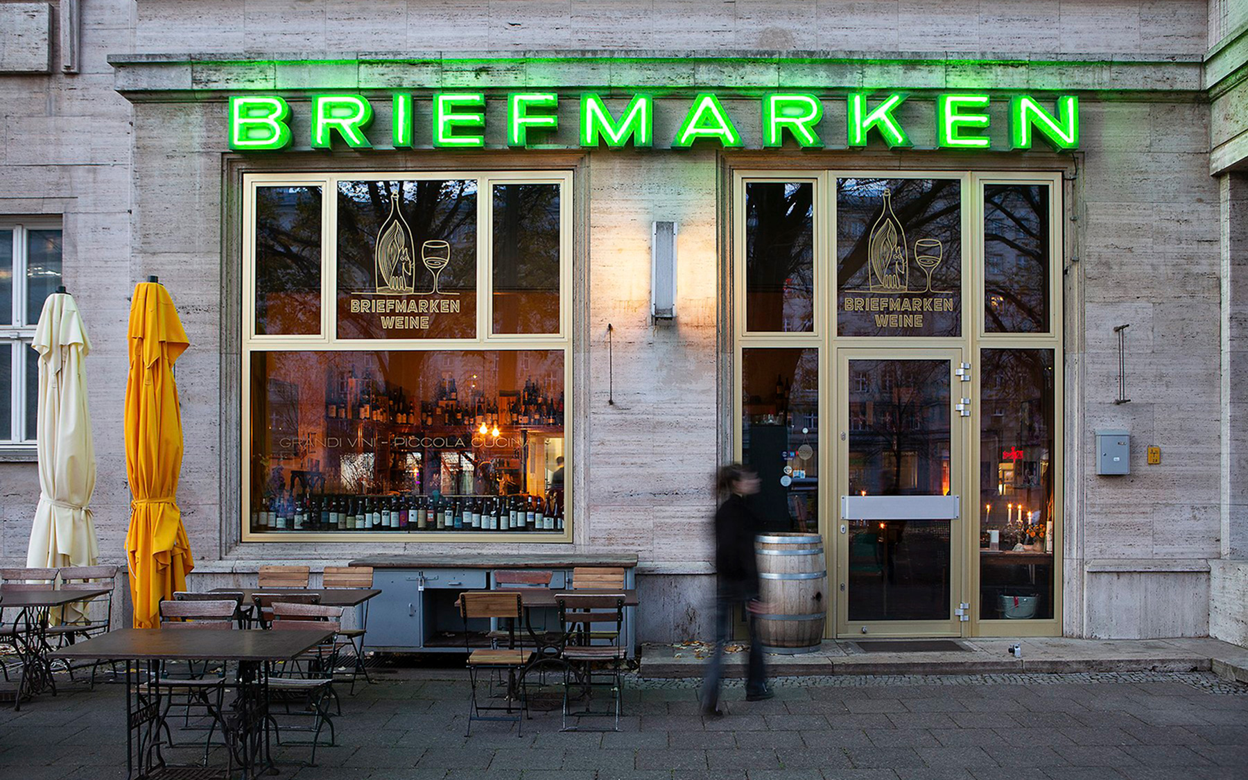
Briefmarken WeinePrinted Matters & Signage
© 2024 Marco Strebinger


